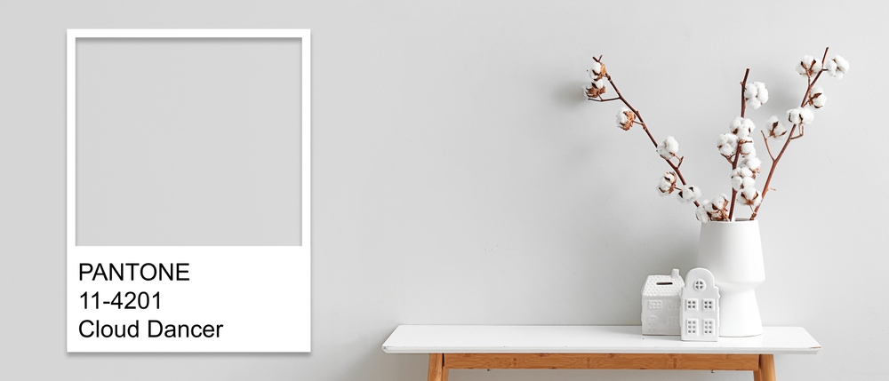
Every December without fail, the design world has a collective pause where Pantone announces its Color of the Year. Then the internet is inundated with a series of confident declarations that this shade will be the defining feature in how we live for the next year. There will be a proliferation of mood boards, the brands will rush to change their color packaging and influencers will hold swatches up to north-facing windows with serious looks on their faces.
This is all very dramatic and intense, but in only twelve months that color will be sidelined. Then we’re expected to believe that the accent wall we painted is too loud or that that couch we purchased looks tired and out of date. The once-trendy hue is oddly and specific like the jokes told at a party that you left too early. This doesn’t happen just because Pantone gets the color choices wrong. Although, yes, we do agree that choosing Cloud Dancer as the color for 2026 might be a bit tone deaf. But it’s the flawed concept that one global color will dictate how our homes feel.
Our homes are not receptacles for trends; they are intimate ecosystems, they respond to light, routine, memory and the psychology of the inhabitants. So, when an annual color trend fails, it’s not solely about the aesthetics, it’s the context that matters. Here, we are not conducting a takedown of Pantone or even the trends at large. After all, trends can be inspiring sources of joy and they can be genuinely useful. However, when it comes to creating a home environment that elevates our daily lives the question should change from “What color is having a moment?” to “What color belongs here?”
The Quiet Psychology of Color at Home
Color works on us before we register language for it, it’s found in our body rather than our intellect. This is why a room may feel tense, calming, compressed or expansive before we notice a single item in it. This is the psychology of color at work, it’s intimate sensations over theory.
In our homes, color does not behave in the same way as it does in a showroom or on a screen. It’s not consumed with a brief glance, we absorb over hours, days and seasons of exposure. That same shade that was invigorating in a brief encounter can feel agitating, if it’s surrounding you when you feel tired. The flipside is that a color that initially felt boring may grow on you and become reassuring as it meshes with your daily life. This slow-burn effect is the reason why many color choices in homes carry the most weight over other design decisions.
Color influences how we navigate spaces, certain hues can encourage a pause and others invite momentum. There are colors that feel protective or create a sense of enclosure and those that invite activity or open up the space. These are not universal or rigid responses, but they are consistent enough to matter. When the color is aligned with how a space is used, it can reduce friction and if it doesn’t, it may look beautiful, but it can feel exhausting.
Our memories can play a pivotal role. We all have associations with color that are shaped by environments we’ve loved, places we’ve lived and even moments we’d prefer to forget. A certain shade that is supposed to feel nostalgic can feel comforting or claustrophobic depending on the person viewing it. This is why the standardization of color psychology is impossible to achieve, it’s subjective, what may soothe one person might anger another. There is no trend report that can supplant a personal history with a color.
There’s also an issue of control. We live in a world that can feel overstimulated and the colors we choose to live with on a daily basis may act like a form of emotional regulation. They can restore balance, soften sharp edges and provide just enough visual stimulation to engage our visual interest without feeling overwhelmed. This is about self-support rather than self-expression, but they don’t need to be in competition.
When we understand that the psychology of color in our homes is not about mastering rules or decoding color charts, it’s easier to notice the patterns of our responses. Think about the rooms that make it easier for you to focus, rest or exhale. When your color choices are guided by your personal observations, they become tools for well-being and decorative decisions. This is where the strict adherence to trend culture fails, it asks the color to perform symbolically when we really need it to perform on an emotional level. Your home doesn’t need to make a design statement, it’s a space for ease, thoughts and the quieter version of you that only shows up in that environment.
How To Choose Colors That Work in Real Spaces—Not Just on Trend Lists
| Room Type | Common Color Mistake | What Actually Works | Why It Elevates the Space |
|---|---|---|---|
| Living Room | Choosing bold “statement” colors from trend reports | Layered neutrals with one grounded accent (e.g., warm taupe + deep olive) | Creates depth and flexibility without overwhelming the space |
| Bedroom | Following calming color trends too literally (e.g., overly cool blues or greys) | Soft, warm undertones (muted clay, dusty rose, warm beige) | Feels restful but still inviting and personal |
| Kitchen | Adopting trendy cabinet colors that date quickly | Timeless base (white, wood, or soft neutral) with color in backsplash or decor | Easier to update without a full renovation |
| Bathroom | Using stark whites or high-contrast palettes seen in design magazines | Subtle tonal palettes (cream, stone, pale green) | Adds softness and a more spa-like atmosphere |
| Home Office | Choosing energizing colors that feel distracting over time | Balanced hues (muted greens, warm neutrals, soft blues) | Supports focus without visual fatigue |
| Small Spaces | Going all-in on bold, trendy shades to “make a statement” | Light-reflective tones with gentle contrast | Makes the space feel larger and more cohesive |
| Open-Concept Areas | Using multiple trendy colors to define zones | A cohesive palette with variation in tone, not hue | Keeps flow intact while still creating distinction |
| Entryway | Ignoring it or defaulting to leftover paint | A slightly richer version of your home’s main palette | Sets a tone that feels intentional from the start |
The Problem With Declaring a Universal Mood
The Color of the Year is marketed as a cultural moment and it’s meant to distill the entirety of the emotional temperature into a single tone. This is equal parts marketing genius and sociology, with a narrative of optimism, collective joy, grounding, calm following chaos or some other compelling concept. These can be admirable and fun, but in reality, they don’t typically translate cleanly onto a section of drywall.
That color may photograph wonderfully on a sun-drenched Milan showroom wall. But, in your home it could feel oppressive and it might read cold in a space where warmth is already a scarce commodity. This is important; mood is not a mass-market product, it’s shaped by architecture, geography and lived experience. A specific globally endorsed color shade will not account for how the light shifts at 4pm in winter in your kitchen. Although color trends make the promise of emotional transformation, they often introduce aesthetic dissonance.
When Color Becomes Costume
Another reason why annual colors may struggle in a real home is that they arrive with too much narrative attached to them. When the shade reaches the public, it can be burdened with meaning. “It’s brave”, “It’s expressive” or “It’s healing”. At this point, the color is no longer a background element, it’s making demands to dominate the narrative.
In the fashion world, this boldness is exhilarating, but in an interior it can feel performative and your living spaces should not feel like they need to audition to be relevant. If a color is primarily chosen for what it symbolizes externally, rather than how it internally functions, the result is that it will feel like a costume. A home requires color choices that age well with familiarity and soften into the daily rituals. They shouldn’t be a constant reminder that you painted the wall because everyone else did it.
The Speed of Trends Versus the Slowness of Living
Another mismatch can be found in the tempo. Trends move quickly, they are fleeting and homes are static and grounded. Paint may be affordable, but using it requires an investment of time, energy and considerable emotional commitment. Your furniture endures for even longer and going with a color that’s designed to peak in relevance in only a year is already a misalignment.
There’s cognitive fatigue when you live with a specific trend-driven color, it may be exhilarating at first, then it can become exhausting. The human eye may not rest and what felt expressive can feel demanding. At this stage, many people start to question themselves and worry that they are bad at choosing colors. In reality, they’ve fallen into the trap of trying to live long-term with a color that was designed to induce short-term excitement. A truly successful home decor palette understands the difference between novelty and nourishment.
Why Some Trend Colors Thrive in Theory but Not Practice
The development of trend colors takes place in controlled environments, like: runways, styled vignettes and renderings. These spaces are where color exists under optimal conditions where any competing elements are kept to the bare minimum. This is why the color can behave as it was intended to and this doesn’t translate well to real homes.
In our own living spaces, we have light that doesn’t always cooperate, inherited furniture, conflicting undertones and other messy elements. A color designed for subtle warmth may look sickly next to the wrong flooring. That cozy shade can feel muddy, if you have shadows that pool in the corners of your room. These are highly specific interactions that cannot be addressed in trend forecasting. This is why many people love certain colors in theory, but in reality they resent them. It’s not that the colors have changed, it’s that they don’t work in the context of a real home.
Choosing Mood Over Moment
Trends fall short because they prioritize the moment over lasting meaning. The alternative to this approach is simple, choose colors based upon mood. This is not the mood that you’re aspiring to project, it’s the mood that you actually want to live with. This requires introspection, instead of thinking about what feels current, ask yourself how you want to feel about this color at a specific time, like 8am on Monday morning. Perhaps it may make you feel focused, calm or energized.
These are great feelings to have in your kitchen or living room, but they are less relevant in a bedroom. Context really does matter and you need to understand the distinctions. Color has a physiological effect, certain hues offer subtle stimulation and others are grounding. The key is to consider the alignment; your bedroom doesn’t need to be dramatic to be expressive. The kitchen doesn’t need to feel brighter to feel lively. Where the mood leads, the color choices should follow, they will be more intuitive and less stressful for daily living.
The Quiet Power of Light
Lighting is the partner in every color story and it’s often overlooked until something goes wrong. This is because natural light changes throughout the day and artificial lighting brings its own biases to the spaces. The color could feel perfectly balanced at noon and then be entirely different after sunset.
Understanding how light works in your home is all about observation and varying times of the day. Ask yourself some relevant questions, such as: “Which spaces are heavily reliant on lamps?”, “Where is light flattened?”, “Where does light feel exaggerated?” and “Which rooms feel warmer even on overcast days?”
The answers to these types of questions will help you to understand the lighting patterns that should guide your color palette choices. When a color works with the available light and not against it, the rooms can feel more coherent and effortless. If light is ignored no amount of trend validation can save the color.
Personal Style Is Not a Mood Board
Many people struggle to choose and use color because they are conflating their own sense of personal style with their aspirations. The result may be a home that can look impressive and yet it may feel disconnected. Style is about reinforcing an identity and not about carefully curating an image.
The colors you select should support how you live and not announce who you think you should be. If you are drawn to warm, honor it and if restraint is calling to you, lean into that. When it comes to color palettes, there is no moral hierarchy and coherence is what truly matters. In a home where the color choices are on the same page, you will always feel more elevated than a home where constant reinvention is pursued.
The Myth of the Perfect Shade
Trend colors are seductive because they promise decisiveness, but color rarely works in that manner. The more successful interiors are often built on near-misses rather than absolute design choices. That perfect shade may be the one that was slightly adjusted to be a little softer or warmer. This is where your personality can shine, you can give yourself permission to deviate and the space becomes yours.
How to Use Trends Without Being Ruled by Them
You can reject trend absolutism without entirely ignoring trends; they are useful cultural signals and they can bring actionable ideas and information. A generous approach is to engage with trends with translation rather than adopting them as is. This may sound complex, but it’s pretty simple in action.
Let’s suppose that there’s a trending color that promises warmth, take that information and ask yourself what warmth means in your own home. This may be a softened neutral tone rather than that exact shade that you see in the design spaces. It could be a texture that supports a pigment rather than a focal point for the room. If you interpret the intention rather than copying the execution, you can maintain your sense of agency in the color selection process.
The scale may matter more than your enthusiasm and a trend color that overwhelms a room may work better when it’s reduced to a smaller gesture. A good analogy is that the trend color becomes seasoning rather than the main course. When color pops up in smaller places that are easier to live with, it’s easier to change them. When a trend color is more permanent it tends to lose its sense of playfulness and lightness.
Longevity is another key factor, ask yourself if you’re likely to enjoy this color if it’s not culturally endorsed. This is not a prediction of regret, it’s checking in with yourself to discover a genuine connection with that color. The hues that resonate on a personal level tend to feel deeper and calmer. They are not reliant on external validation to feel relevant in your home.
Trends can work well when they enter a color palette that’s already coherent. Instead of rebuilding your decor around the current thing, you can allow the trend to converse with what’s already there. That fresh shade may complement your existing finishes and materials in unexpected ways. This can feel intentional rather than reactive and it can make your home feel like it’s evolving without becoming uncomfortable or unstable.
Finally, allow yourself to engage with trends on an intellectual rather than a material level. When you examine a color, you can appreciate the story behind it, why it exists and even enjoy how others are using it. But, you don’t necessarily need to have it in your own home. There is no requirement for every beautiful idea to find a place in the space that you inhabit. If trends are treated as a form of inspiration instead of authority, they can become energizing forces that bring freshness without erasing your identity.
The Long Goodbye to the Color of the Year
The Pantone Color of the Year will return next December with the same fanfare and it will inspire, provoke and even delight its audience. But, it will inevitably cause disappointment in people that expect it to do more than it can. Real color choices are not dependent on trend reports and they often occur in those quiet moments of noticing. It’s spending the time to discover which colors energize, soothe and comfort you and how they mesh with your home. When you learn to trust your observations, your living space will be less about keeping up with trends and more about settling into living.